
You have only 8 seconds to grab a visitor’s attention. That’s less time than it takes to check a notification or sip a coffee. In that short span, your landing pages has to convince someone to stay, explore, and take action. That’s the high-stakes world of modern digital marketing.
But here’s the twist: most landing pages fail. Why? Because they rely on outdated strategies, generic templates, or just plain guesswork.
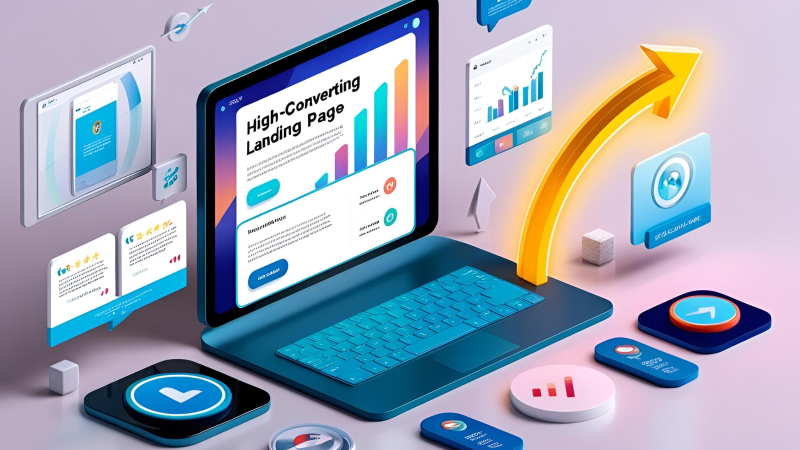
In this post, we’re diving deep into five battle-tested best practices to supercharge your landing pages. Whether you’re a marketer, designer, or business owner, these insights can help you build landing pages that don’t just look good, but convert.
Why Landing Pages Matter More Than Ever
In 2025, the digital landscape is louder than ever. Your audience is bombarded with ads, notifications, and offers every second. A powerful landing page is your chance to break through that noise.
According to a recent Unbounce report, optimized landing pages can increase conversion rates by up to 300%. But crafting one that truly performs takes more than just a catchy headline and a form.
Let’s walk through what actually moves the needle.
1. Laser-Focused Messaging
📌 Why It Matters:
Visitors need to immediately understand the value of your offer. If they have to think twice, you’ve already lost them.
🔍 What You Can Do:
- Start with a clear value proposition. What problem are you solving?
- Match ad copy with landing page content to ensure message alignment.
- Avoid clutter. Stick to one CTA (call-to-action) per page to avoid decision fatigue.
💡 Pro Tip: Use the “5-second rule”: if someone can’t tell what your page offers in 5 seconds, rewrite your headline.
🎯 Real-World Example:
We helped a SaaS client boost signups by 42% just by simplifying their landing page headline and aligning it with their Google Ads copy.
2. Streamlined Design with Purpose
📌 Why It Matters:
Good design is more than aesthetics—it’s about guiding attention. Eye-tracking studies show users read in an “F” pattern. That means your layout matters more than ever.
🔍 What You Can Do:
- Use visual hierarchy to emphasize key points (headline > benefits > CTA).
- Minimize distractions: remove unnecessary links and navigation.
- Use contrasting CTA buttons to draw the eye.
📊 Table: High-Converting Design vs. Poor Design
| Element | High-Converting Landing Page | Poor Landing Page |
|---|---|---|
| Headline | Clear, benefit-driven | Vague or generic |
| Visual Focus | CTA button stands out | Blends in with background |
| Navigation | Removed or minimal | Full site menu included |
| White Space | Ample spacing guides attention | Cluttered and cramped |
🧠 Insight: A visually “simple” page often performs better than a design-heavy one that lacks direction.
3. Compelling Social Proof
📌 Why It Matters:
We trust others’ experiences more than marketing claims. That’s why testimonials, reviews, and trust badges can massively impact conversions.
🔍 What You Can Do:
- Add video testimonials or screenshots of real customer feedback.
- Display logos of well-known clients or industry certifications.
- Incorporate dynamic social proof (e.g., “200 people signed up today”) using tools like Proof.
💡 Pro Tip: Place testimonials near your CTA to reduce hesitation.
🎯 Case Study:
When we added a rotating carousel of Google reviews to a coaching client’s landing page, conversions increased by 23% in two weeks.
4. Speed & Mobile Optimization
📌 Why It Matters:
According to Google, 53% of users abandon sites that take longer than 3 seconds to load. And with over 60% of traffic coming from mobile, mobile-first design isn’t a luxury—it’s a must.
🔍 What You Can Do:
- Use lightweight images and compress them with tools like TinyPNG.
- Implement lazy loading for media assets.
- Optimize for mobile breakpoints, ensuring your layout and buttons scale well.
⚙️ Tools to Test Performance:
🧠 Quick Win: Replace background videos with a static image on mobile for faster loading.
5. Strategic A/B Testing
📌 Why It Matters:
Even seasoned marketers can’t predict which version will convert best. A/B testing removes the guesswork.
🔍 What You Can Do:
- Test headlines, images, button copy, and layouts.
- Run experiments one variable at a time to isolate results.
- Use platforms like Google Optimize or VWO.
🧪 What to Test:
| Element | Variation Ideas |
| Headline | Benefit-driven vs. curiosity-driven |
| CTA Button | “Start Free Trial” vs. “Get Instant Access” |
| Layout | Two-column vs. single-column design |
💡 Pro Tip: Let tests run for at least 1-2 weeks and gather statistically significant data before making changes.
🎯 Bonus Tip:
Use heatmaps (e.g., Hotjar) to see where users are clicking and scrolling most.
Conclusion: Build Landing Pages That Actually Work
Great landing pages aren’t built by chance. They’re engineered through clear messaging, intentional design, psychological triggers, and data-driven improvements. The best part? You don’t need to reinvent the wheel.
Just focus on:
- Speaking directly to your audience.
- Guiding their attention.
- Earning their trust.
- Delivering a seamless experience.
- Testing everything.
Whether you’re launching a product, growing an email list, or promoting a webinar, following these landing page best practices can be the difference between “just okay” and outstanding.
What Next?
If you’re ready to put these best practices into action:
✅ Bookmark this guide for your next campaign
✅ Share it with your marketing team
✅ Or contact us for a free landing page audit
And if you have a landing page tip or A/B test story to share, drop it in the comments. We’d love to learn from you!
Stay optimized!


